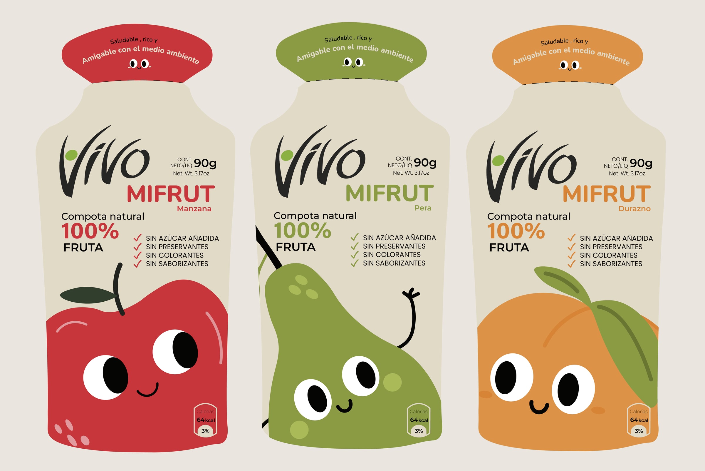
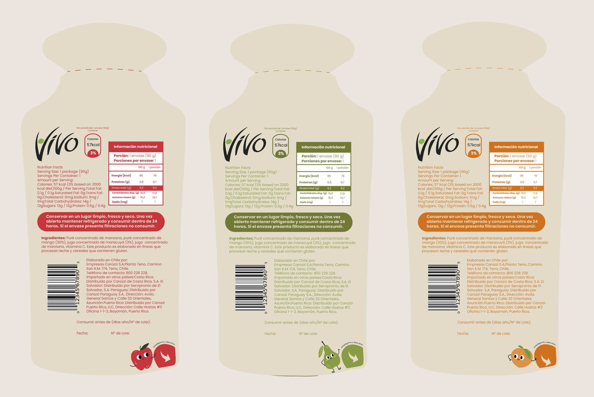
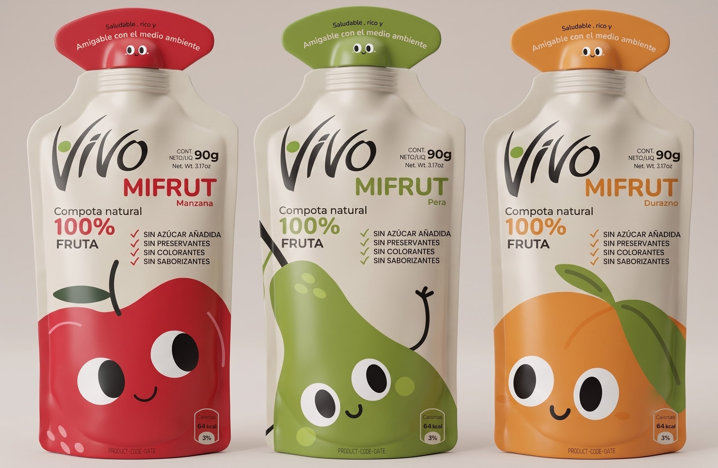
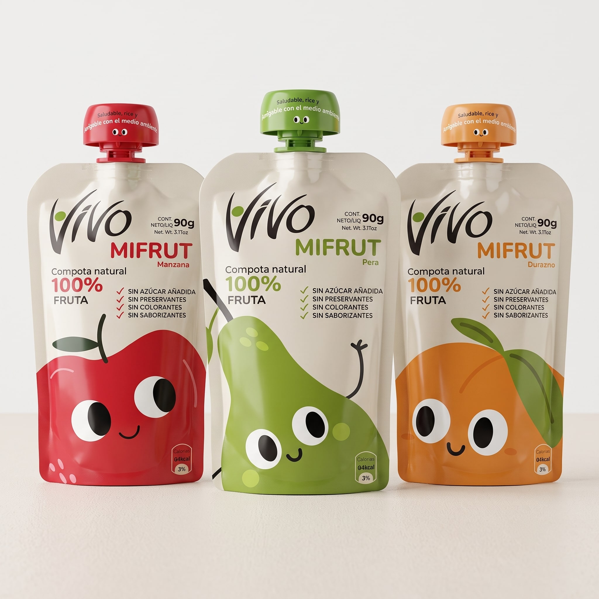
A sustainable packaging redesign for fruit purees, with playful graphics aimed at children.
Year
2024
Role
End-to-end design
The brief
A redesign of the Vivo pouches around packaging that comes apart cleanly. The
layers separate, which is what makes the pack recyclable in practice, and the
format sheds the pieces it never needed.
The new graphics connect with children, turning the pack into something
considered and useful rather than decorative.
The pack and its characters
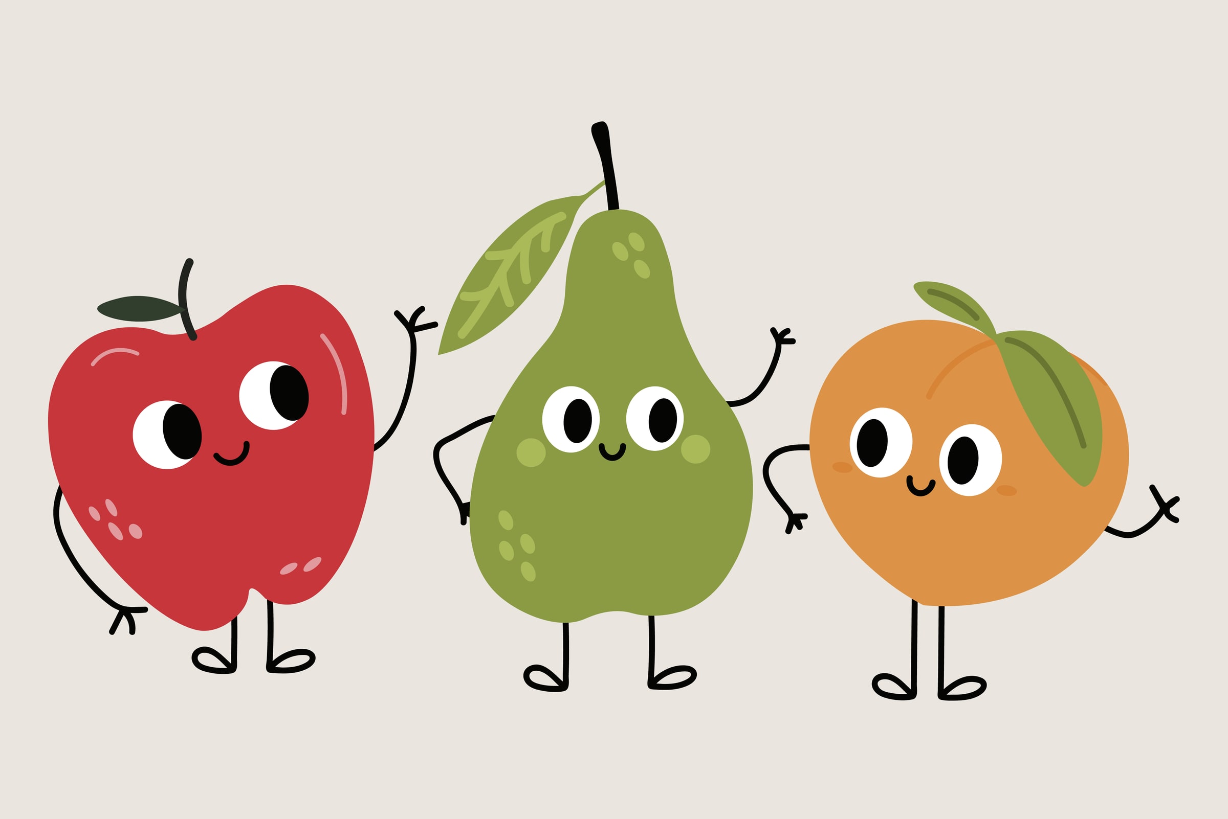
Apple, pear and peach.
One character per flavor, drawn with the same hand as the logotype.